The Psychology of Font
Fonts are the building blocks of any campaign or creative work. They can effectively communicate ideas and tones and play a crucial role in shaping how audiences perceive your brand. Similar to color psychology, font psychology can communicate that you’re trustworthy, professional, or edgy. Ultimately, there is a strong connection between fonts, colors, and how they set a unified brand identity.
How Different Fonts Shape Perception
The five main font styles in most people's rotation are serif, sans serif, retro/vintage, experimental, and calligraphic. Each of these five font families has its own unique feel and personality. It’s important to understand the nuances between each before deciding which one you want to represent your brand.

Tradition, Trust, and Elegance
Serif fonts are a classic pick for many. This is due to the fact that they evoke feelings of tradition, reliability, and authority. Many brands and academics default to serif fonts for the professional and formal feeling they emanate. The distinctive “feet” and “tails” at the end of the letters give serif fonts a sense of stability and structure. The big three serif fonts include Times New Roman, Garamond, and Baskerville, and you’ll often find these as default fonts for starting documents.

Modern, Clean, and Minimal
In a similar vein, sans serif fonts convey a modern, approachable, and clean vibe. They’re appealing to those who want to emulate simplicity and efficiency. Fonts in this family are composed of clean, straight lines which can have a slight curve in the tail on some characters, but lack overly decorative serif lining. Just this slight tweak in appearance makes a huge difference in tone. Sans serif fonts are perceived to be more user-friendly and contemporary, thanks to that seemingly slight shift in format. Common fonts in this family include Helvetica, Arial, and Futura.

Nostalgia, Personality, and Creativity
If you’re looking for a font that conveys personality and fun, retro/vintage fonts hit this mark perfectly. These fonts evoke feelings of nostalgia and creativity. They make a brand seem fun, quirky, and bring out the full character of your brand. Retro/vintage fonts are composed of playful curves, bold strokes, or a hand-crafted look that harken back to a previous era. Commonly used fonts in this family include Bebas Neue, Lobster, and Brush Script.
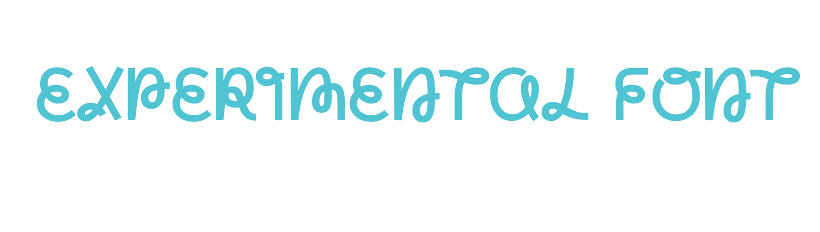
Unconventional, Bold, and Unique
If your brand is all about subverting expectations, experimental fonts are what you need. They’re known for their boldness and unconventional appearance. They pack a punch and are often used to make a strong statement as they attract attention. Experimental fonts are composed of unique shapes, maybe even broken letters or distorted forms that challenge traditional design principles. There is such a wide range of what these fonts look like, but three great examples of this family are Zilla Salb, Bungee, or custom typography designs.

Elegance, Personality, and Craftsmanship
The most upscale of these five font families are calligraphy fonts. These are known to exude elegance and sophistication with a personal touch. They give a sense of handcrafted quality and artistry. Calligraphic fonts are full of flowing, cursive lines or handwritten style fonts that mimic the strokes of a calligraphy pen. Pacifico, Brush Script, and Great Vibes are headliners for this font family.
Choosing the Right Font for Your Brand
There are so many fonts to pick from that it can often feel overwhelming to know what is best for your brand image. It’s important to note what tone each font family brings forward and to understand the blending of the many elements that make up your brand, including your font choice. You wouldn’t use experimental fonts in a more professional setting, just as you wouldn’t use serif fonts for an eclectic feel. Each font contains different connotations, and harnessing font psychology is the first step in polishing your brand image. If you’re ready to elevate your brand with thoughtful design elements, contact us!
