Pyper Young Becomes Pyper, Inc.
BUT THE PY STAYS
As one of the original founders departed from the agency, Pyper Young needed to rename and rebrand. Since our inception, we knew the names on the door did not necessarily represent the group as a whole, therefore we had always referred to ourselves as an agency simply as “PY”. So, when the name was simplified to Pyper, Inc., we were able to retain our PY nickname, as the PY also represents our unique spelling of Pyper - which always has to be spelled out.
A new name led us to developing our new logo, which was then executed in signage, business suite, social media, and of course, a launch party.

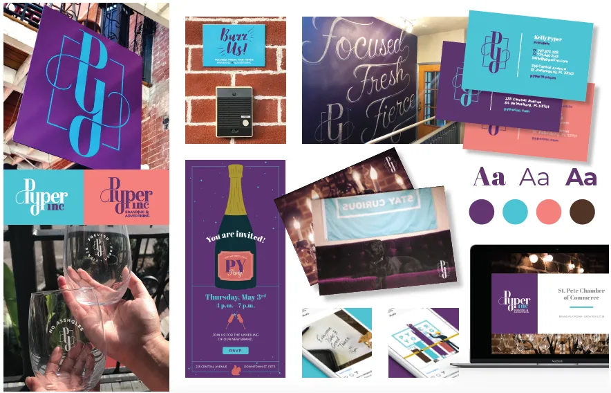


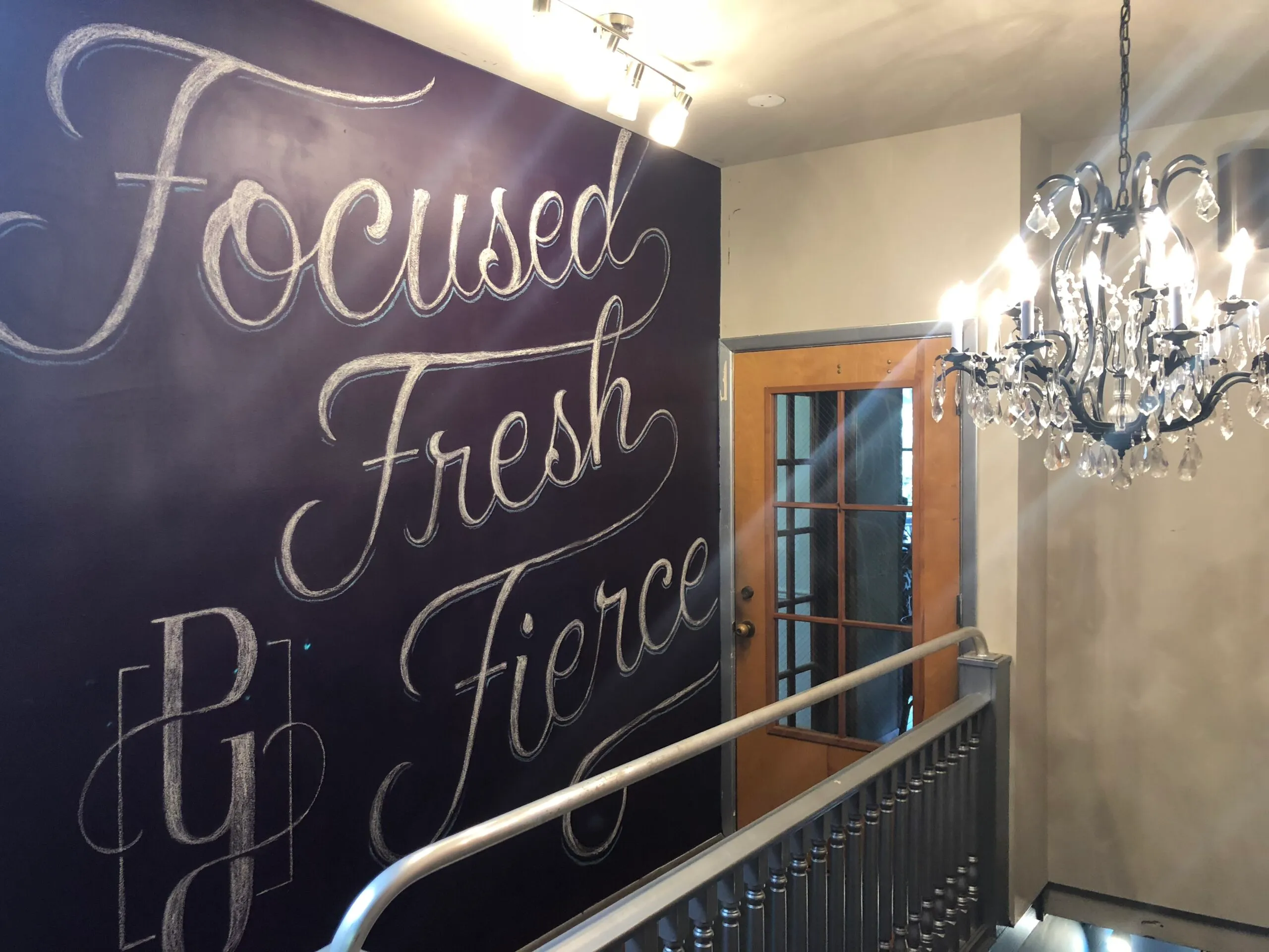
After teasing the market for several weeks, we were proud to share our sophisticated new look and the transitional journey the agency endured in its six years. The rebrand was capped off with a killer party to celebrate our future. Guests were greeted by our new chalk wall decor and treated to wine glasses communicating a few of our core values.

