Packaging Design that Makes Your Brand Stand Out
As a team of marketing experts and wine lovers, we’re drawn to the fact that consumers tend to buy wine based on the label— bright illustrations stand out on the shelf against a simpler design. Packaging is often your brand’s first impression on a consumer, and creativity captures attention.
Effective packaging is essential for a product's success as it not only protects the product but also serves as a key marketing tool. Packaging should strengthen the brand’s presence in the market and align with your business goals. The elements of good packaging can vary depending on the product, target audience, and industry, but best practices include:
Functionality: Packaging should protect the product, be easy to open, and reseal, if applicable.
Branding: Packaging is one of the main tools of brand recognition. Logo, fonts, color palette, and other brand elements should be consistent across products, attracting attention while promoting awareness.
Aesthetics: The memorable and attractive brand identity conveyed on your packaging should speak directly to your target audience. Consumer preferences are constantly evolving, so considering the latest visual trends will help your product resonate. For instance, our Creative Director loved the packaging for her new Eva NYC hair dryer so much that she saved it to serve as design inspiration. The limited edition, shiny tin box featured candy-colored florals outlined in silver foil. Around the box was a paper wrap featuring brand elements embossed in raised spot gloss and silver foil. Eye-catching in feminine colors consistent with the brand, a tactile feeling to the elements, and sturdy—the box can be reused as a storage container.
Informational Clarity: Clear and concise information about the product’s features, usage instructions, ingredients, and any relevant benefits or warnings should be prominently displayed, helping consumers make informed decisions.
Differentiation From Competitors: Distinctive features help create a memorable presence so a product will stand out on the shelf among competitors. Good packaging is more than just aesthetics and structure, it also means sustainability. Our local coffee spot across the street, Craft Kafe, carries coffee beans that always catch our Creative Designer’s eye. Onyx Coffee Labs has an uncommon packaging design choice when it comes to their coffee—boxes, not bags—that are made out of 60% compostable, all renewable film layers, and unbleached, uncoated cardboard. They stand out from common retail coffee bags with their unique shape, materials, and unexpected color palette. Eye-catching, tactile, and sturdy with an added bonus of earth-friendly!
Sustainability: Using eco-friendly materials, minimizing packaging waste, and providing recycling information can enhance a brand's image. A recent consumer report reveals that 62% of Gen Z shoppers prefer to buy from sustainable brands, and a staggering 73% are willing to pay more for sustainable products. Moreover, Gen Z and Millennials are the most likely to make purchase decisions based on personal, social, and environmental values. Prioritizing sustainability will keep brands competitive to the next generation of consumers.
Durability: Packaging needs to withstand the rigors of the supply chain and shipping without compromising the integrity of the product.
Cost-Effectiveness: Balancing the cost of packaging with its quality and impact is crucial. Packaging should add value to the product, not cost.
Practicality and Convenience: Packaging should be easy to handle, store, and dispose of.
Regulatory Compliance: Packaging must adhere to local, federal, and international regulations and standards. This includes safety standards, labeling requirements, and any other relevant regulations. Take the alcoholic beverage industry: each bottle label has precise requirements to describe the product, how it was distilled or fermented, bottled, and produced all based on distribution plans and volume of the product. We’ve learned the ins and outs of TTB regulations with 82° West Distilling and Kozuba & Sons Distillery.
Let’s look at how we developed effective packaging that satisfied our clients’ needs and wowed their target audiences.
4Points Dental Designs
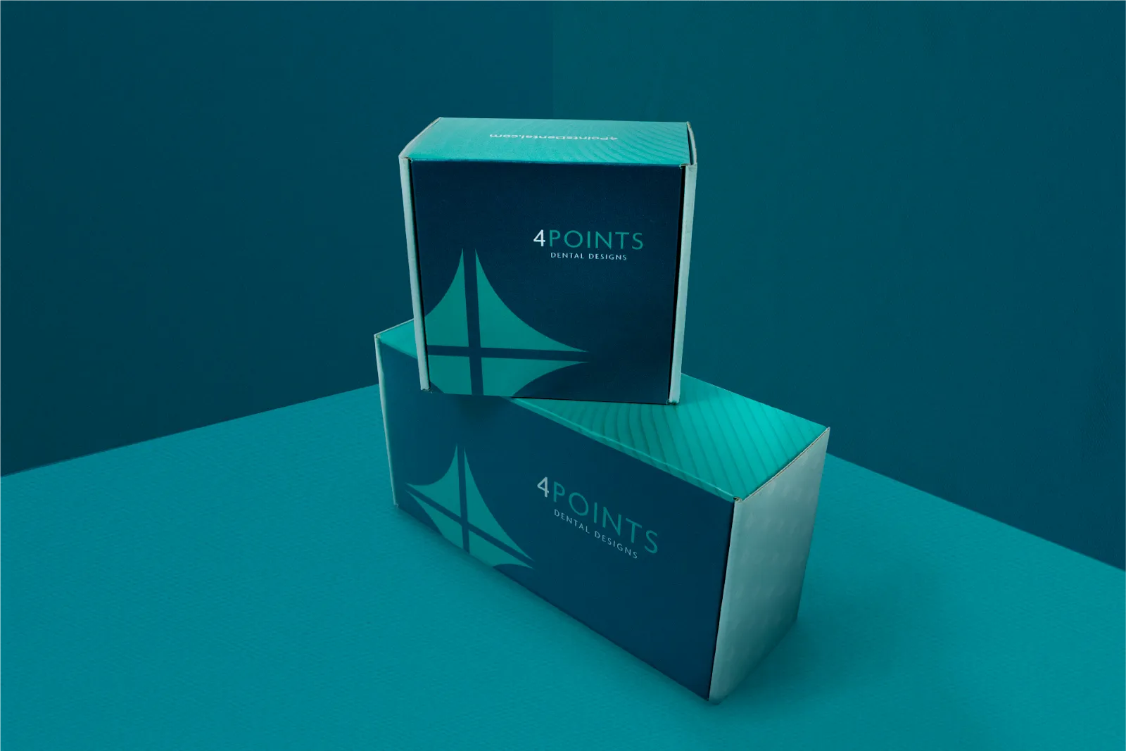
While crafting this high-end dental company’s brand refresh, we created custom packaging and patient care kits for their premium dental implants, bridges, crowns, and veneers. The quality of the products are highlighted by the visually appealing color palette and the various textures on the box, making the brand stand out amongst competitors that generally have a more clinical look.
Read more about the creation of this visual identity.
82° West Distilling
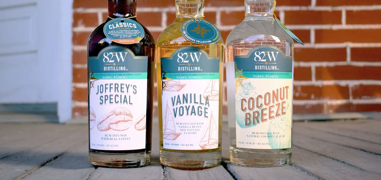
Each flavor in the 82º West Distilling line is represented by its own unique, hand-drawn illustration of the ingredients, such as Coconut Breeze, or the flavor name, such as "Mutiny", which features skulls and peppers. In order to distinguish the different rum collections, each line has a different type treatment on the label design.
The labels came to fruition with custom illustrations at the forefront of the design. The front labels feature a custom die-cut shape and the compass rose brand element in metallic gold foil. The illustrations are used as a motif, reminiscent of stamps, and their color and type treatment differentiates the rum collections. Some of the releases featured hang tags that tell the collection’s story.
Read more about this nautical line of labels.
Palm CBD Seltzer
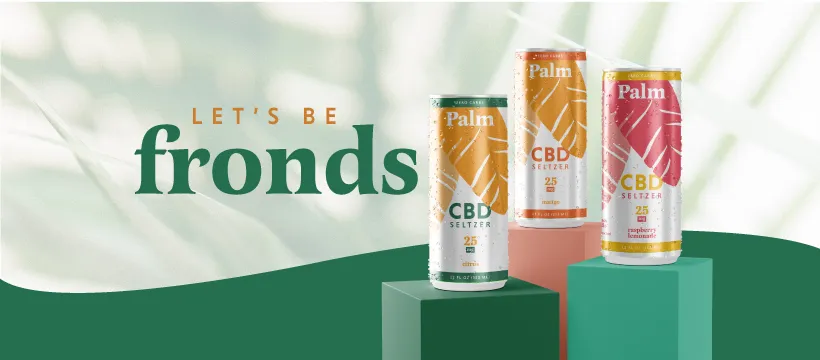
When branding 3 Daughters Brewery’s CBD seltzer, we did market research (and some taste testing ourselves) to recommend its skinny can design, which continues to be all the rage in canned cocktails. The design is fresh and fun and its messaging exudes relaxation, drawing on the tropical paradise of St. Petersburg, FL, where 3D calls home. The name Palm, referring to palm fronds, also rhymes with “calm,” which CBD seltzer promotes. Playful messaging and a bright, tropical palette make the brand feel like the go-to non-alcoholic beverage in our warm climate.
Read more about this refreshing packaging.
Drink Katy’s
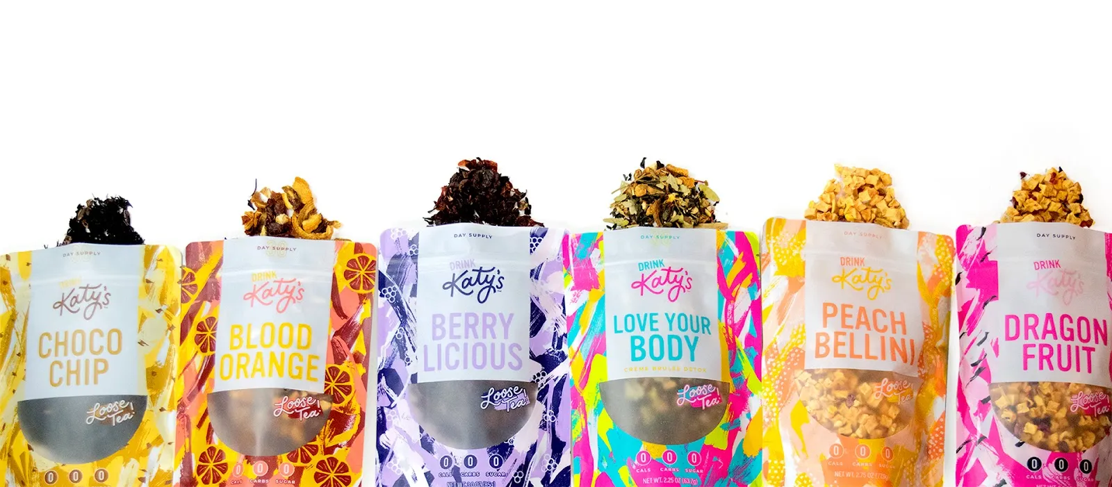
Katy’s started out of a family coffee business, and the founder wanted to branch out with a line of tea flavors to market to young, health-conscious consumers. In order to differentiate this e-commerce brand from the competition, we developed a vibrant, joyful color palette with an array of patterns featured on the packaging and retail products. A translucent window on the front of the resealable bags allow for a peek at the texture and quality of the product. In addition to the tea packaging, we created tags for the company’s unique tumblers, and custom inserts and tape for their shipments.
Read more about this fun and flavorful packaging.
At Pyper, Inc., we love branding and designing products that you can actually feel, taste, and smell. When the elements of smart packaging are combined with great products and strategic brands, they contribute to a positive user experience and, ultimately, increased sales for the client.
